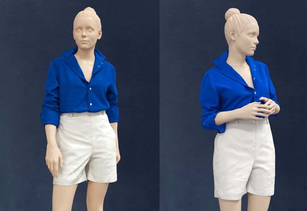
These projects showcase long‑term UX thinking, scalable design systems, and real‑world usage by thousands of users.
https://lemotionatelier.com/
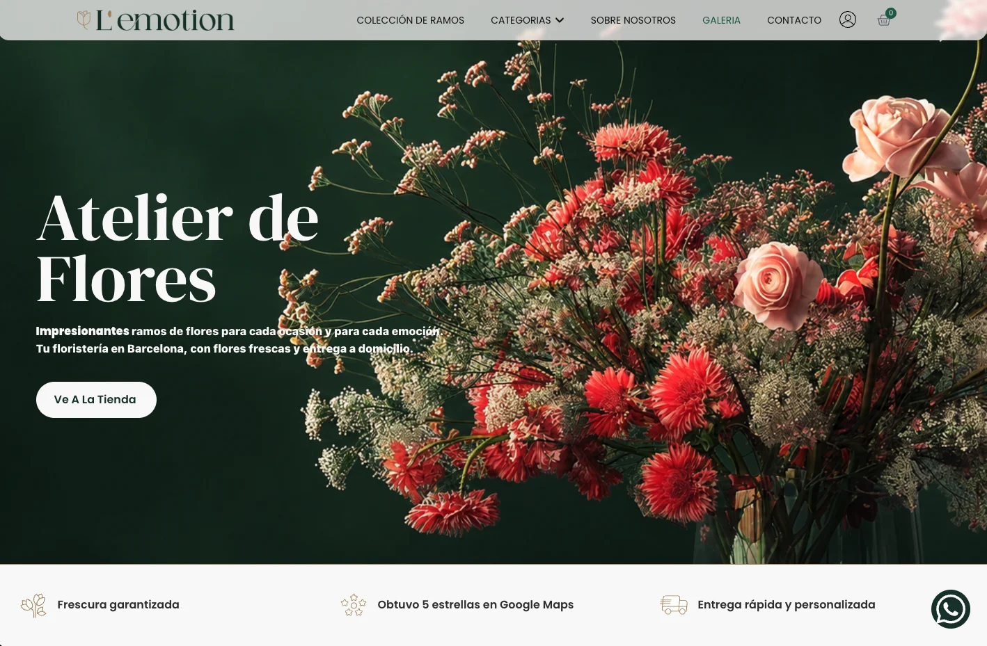
The client wanted an e-commerce website that could make ordering online simple and intuitive while preserving the character of their physical flower shop, sophisticated, artistic, and highly attentive to detail.
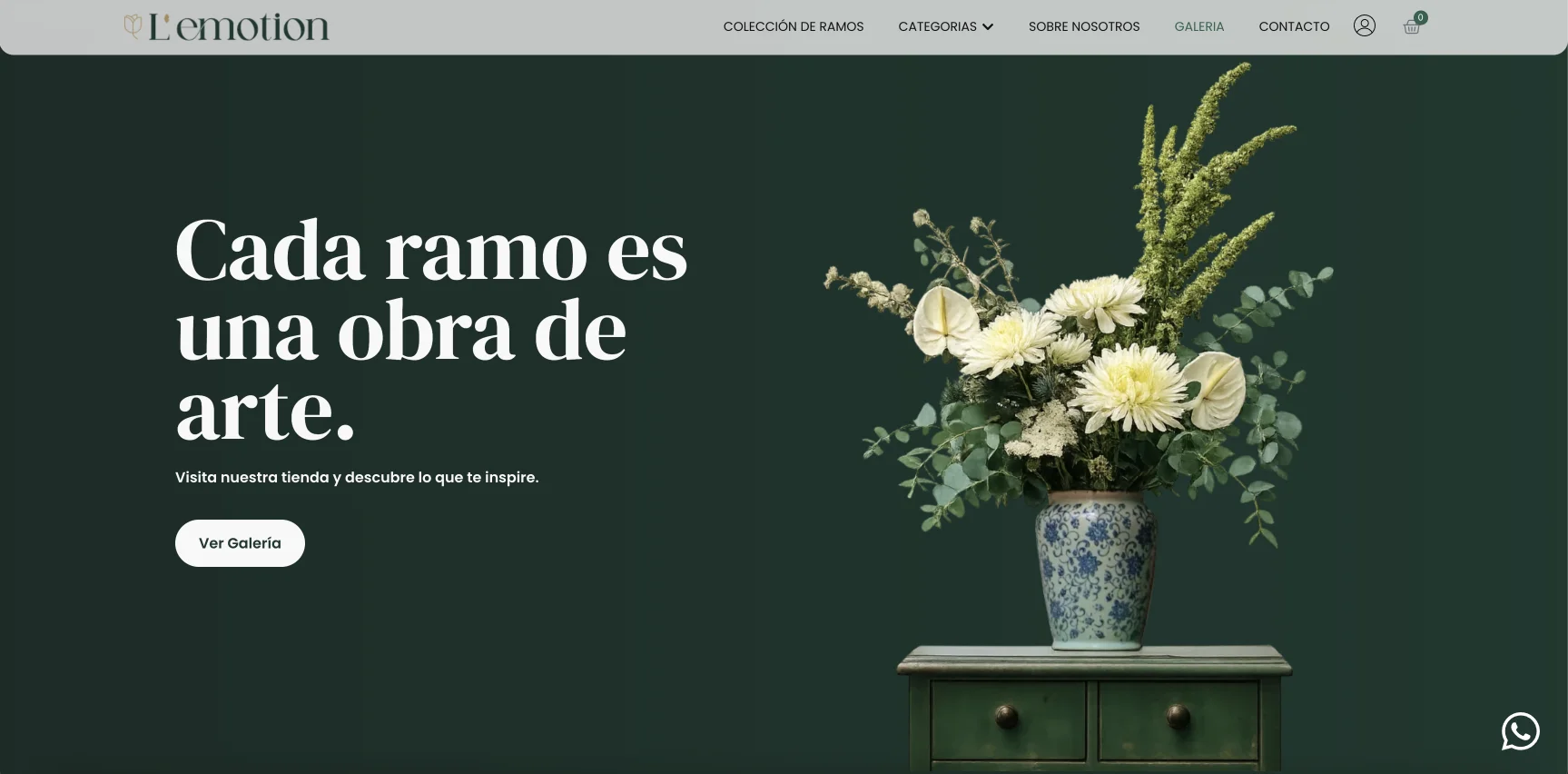
The design was intentionally kept clean and understated, allowing the bouquets themselves to take center stage. Large, carefully selected imagery, generous whitespace and restrained typography create a luxurious feel without getting in the way of the shopping experience.
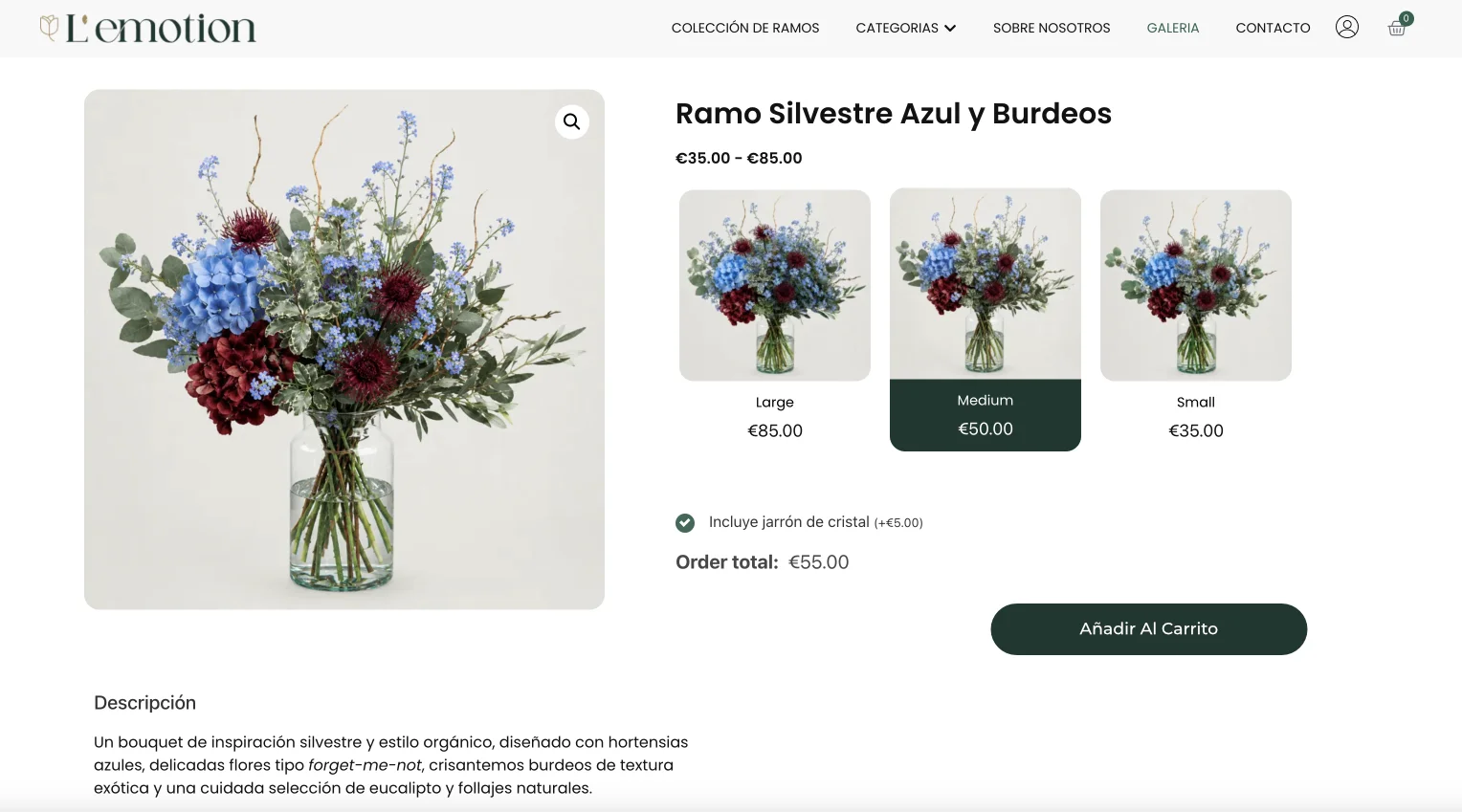
The website was designed around the way customers actually choose flowers: discovering a bouquet visually, understanding its style and size, selecting options, and completing an order quickly. Product size variations, delivery information and checkout were integrated into a streamlined purchasing journey.
A refined e-commerce experience that combines the convenience of online ordering with the visual character and craftsmanship of an independent floral studio.
https://sisartgift.com/
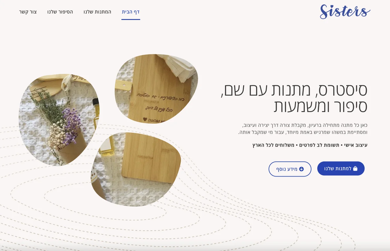
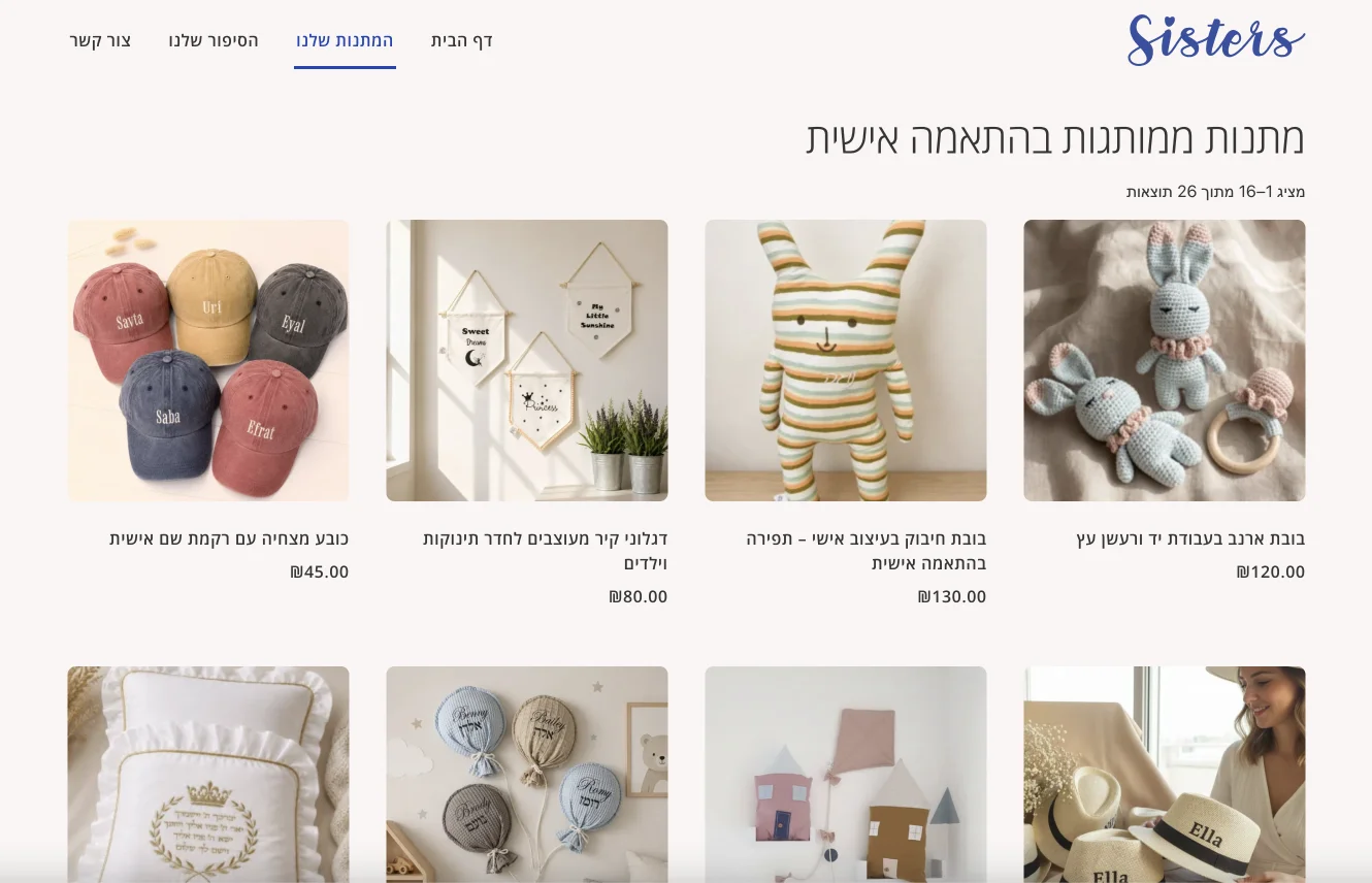
Sisartgift (Sisters) creates unique, personalized gifts with an emphasis on professional craftsmanship and personal attention.
The challenge was to translate an existing brand identity into a digital experience while preserving its handcrafted character.
I introduced organic, amorphous SVG image masks that partially interrupt the photography, creating a tactile, imperfect feel. These shapes contrast with the site’s clean typography, straight lines, and structured sections.
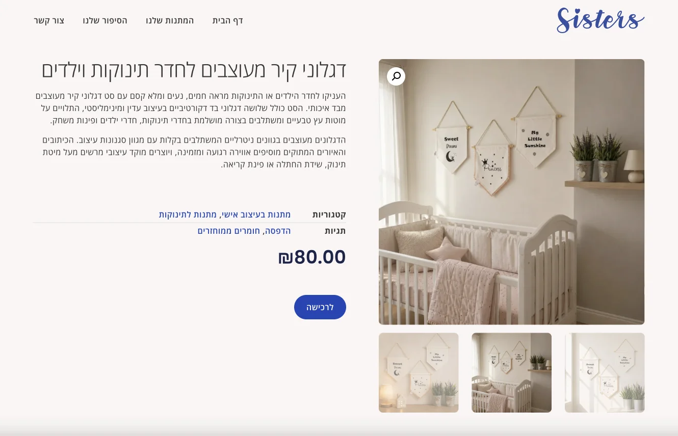
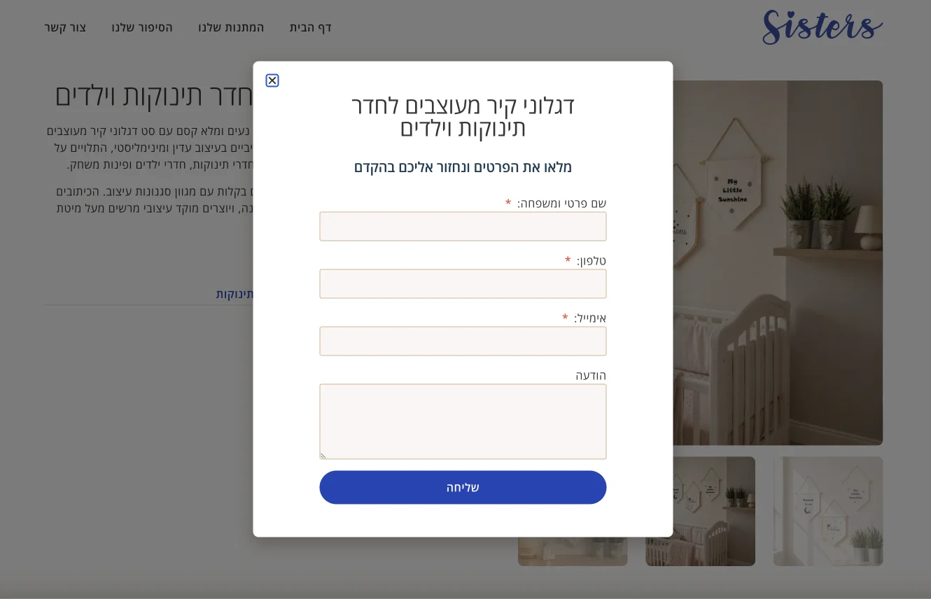
The client wanted to showcase products without turning the website into a conventional online store. I therefore built the site on WooCommerce in catalog mode, with a dynamically generated contact form on each product page allowing customers to inquire about the specific product.
The architecture is also prepared for a future transition to full e-commerce, without requiring the site to be rebuilt.
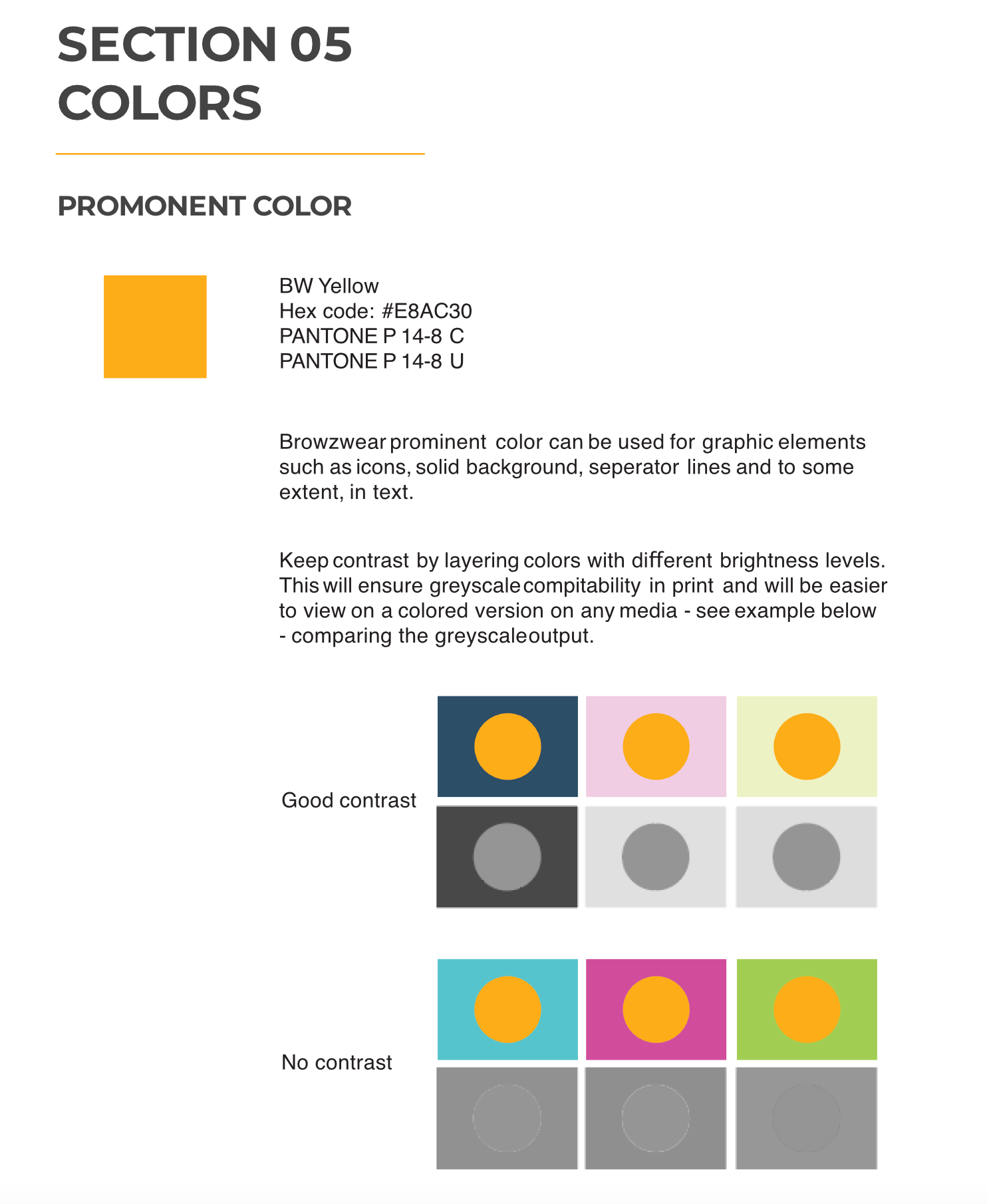
Branding and art-directing for a growing strat-up in the fashion tech industry, between 2016 -2019. https://browzwear.com/
Fashion brands had never worked in a 3D-driven workflow. The fashion industry relied on physical samples, long development cycles, and expensive iteration.
Browzwear wasn’t just selling software, it was introducing a new way of working.
The branding challenge was twofold:
Translate complex technology into clear, practical business value.
Browzwear brand had to feel authoritative, stable, and real, not experimental.
The answer was structure and consistency.
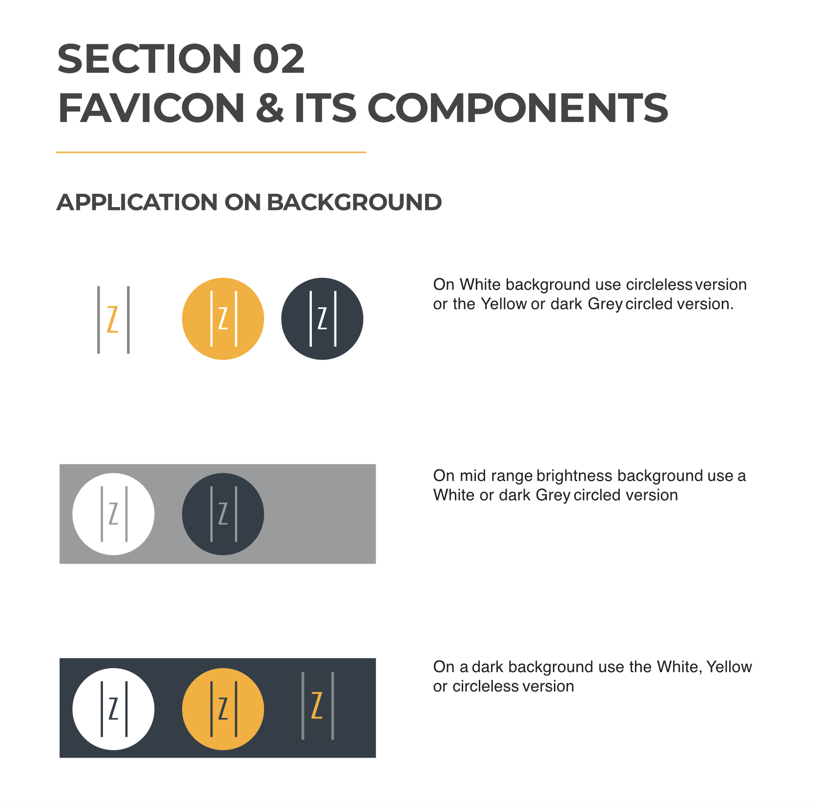
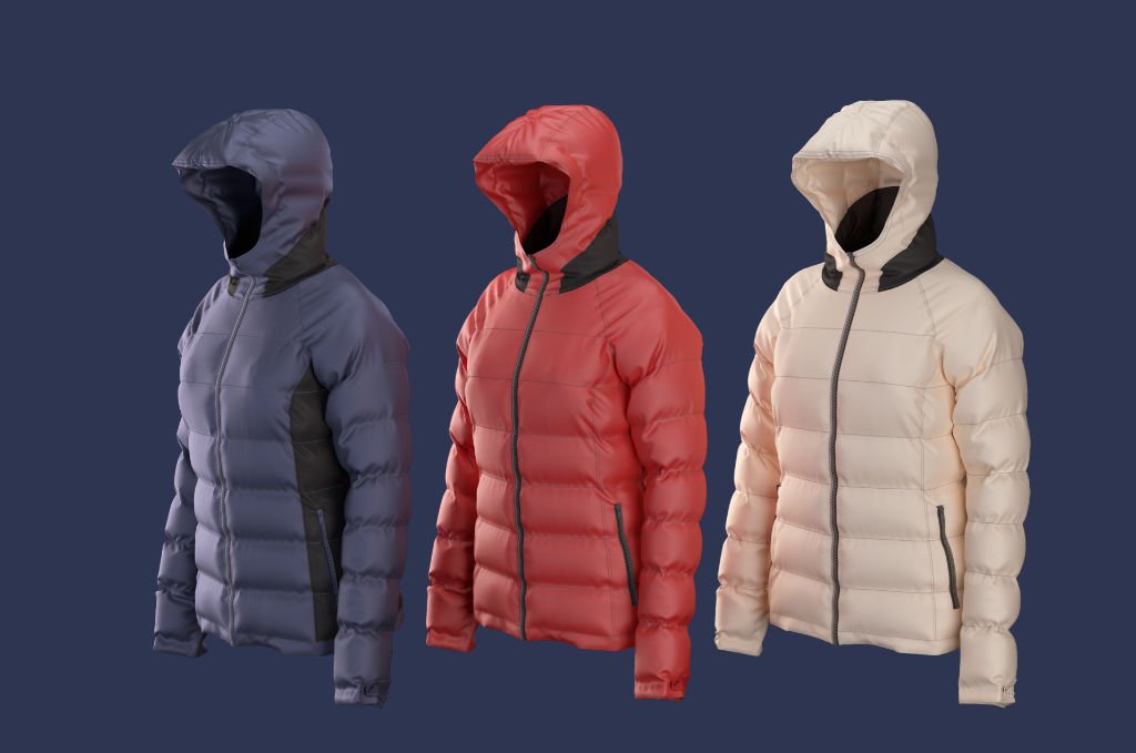
I created a comprehensive brand system that aligned messaging, visuals, and product output under one coherent identity.
https://browzwear.com/
In 2016, most fashion brands and manufacturers were still unfamiliar with the potential of 3D garment simulation.
The apparel industry was dominated by slow, expensive, and inefficient processes, heavily reliant on physical samples, long iteration cycles, and resource-intensive production.
While Browzwear’s technology offered a transformative alternative, prospects struggled to understand what a 3D-driven workflow actually looked like and how it could fit into their existing production pipelines.
The challenge was not just visual design, but education: clearly explaining a new way of working to an industry that had never seen it before.
Over several years, I designed and evolved Browzwear’s website with a strong product-led narrative. Working closely with the marketing manager, we redefined the look and feel of the site to tell a clear, compelling story: how 3D garment simulation can transform the apparel industry into a faster, more sustainable, and more efficient ecosystem.
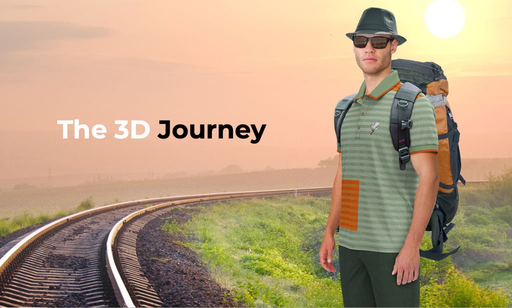
I initiated a homepage experience that explained the full 3D workflow immediately, using animated graphics triggered by scroll interactions. Each scroll revealed another stage of the production process, emphasizing 3D as the single source of truth across the entire pipeline – from design to manufacturing. This approach helped prospects quickly grasp the value of 3D, highlighting tangible benefits such as reduced physical samples, lower water consumption, decreased CO₂ emissions, and minimized toxic waste.
The redesigned website turned a complex, unfamiliar technology into a clear and compelling product story.
The site made Browzwear’s value proposition easier to understand, helping prospects see the business case for 3D and accelerating client acquisition.
https://browzwear.com/products/v-stitcher
VStitcher users work with a vast and complex set of resources – fabrics, seams, trims, and artworks – applied across both 2D patterns and 3D garments.
The core challenge was designing an interface powerful enough to handle this complexity while remaining accessible to fashion designers and patternmakers, not 3D artists. Most users did not come from a 3D background, making the learning curve inherently steep. The UI needed to support advanced workflows without overwhelming users or requiring technical 3D expertise.
Over several years, I designed and evolved multiple interfaces for Browzwear’s including a complete overhaul. The interface was structured around clarity, predictability, and professional efficiency.
The UI organizes work into three clear zones:
A UX architecture designed a decade ago that still enables Browzwear’s teams to scale functionality without compromising discoverability – surfacing important tools while keeping complexity out of the way for expert users.
Add your details and we will get back to you shortly
We use cookies to improve your experience on our site. By using our site, you consent to cookies.
Manage your cookie preferences below:
Essential cookies enable basic functions and are necessary for the proper function of the website.